"Green and Clean" is a fictional conference focused on renewable energy. The focus of this project was to create a visual identity for this event and to design a foldable poster/brochure, a website and a booklet for this event.
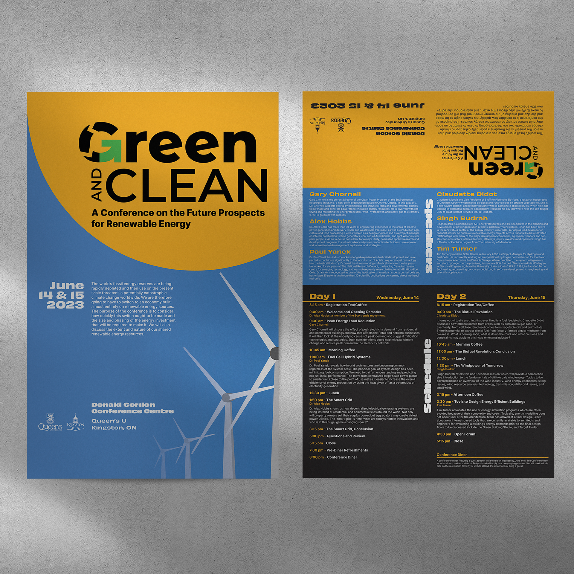
The requirement for this poster was that it needed to be foldable so that it can be mailed as a small folded package. This also meant that most of the information about the event had to fit in an 11 x 17 inches page, which would measure 5.5 x 4.25 inches when folded.
I decided to put the titles of each section in the middle as they'd be big enough to still be readable after folding, and also because I didn't want to use the traditional titles on top of each section.
I also decided to use different colours per section to show where the horizontal folds go, making it easier to fold in assembly as well as providing a more visible separation between sections.
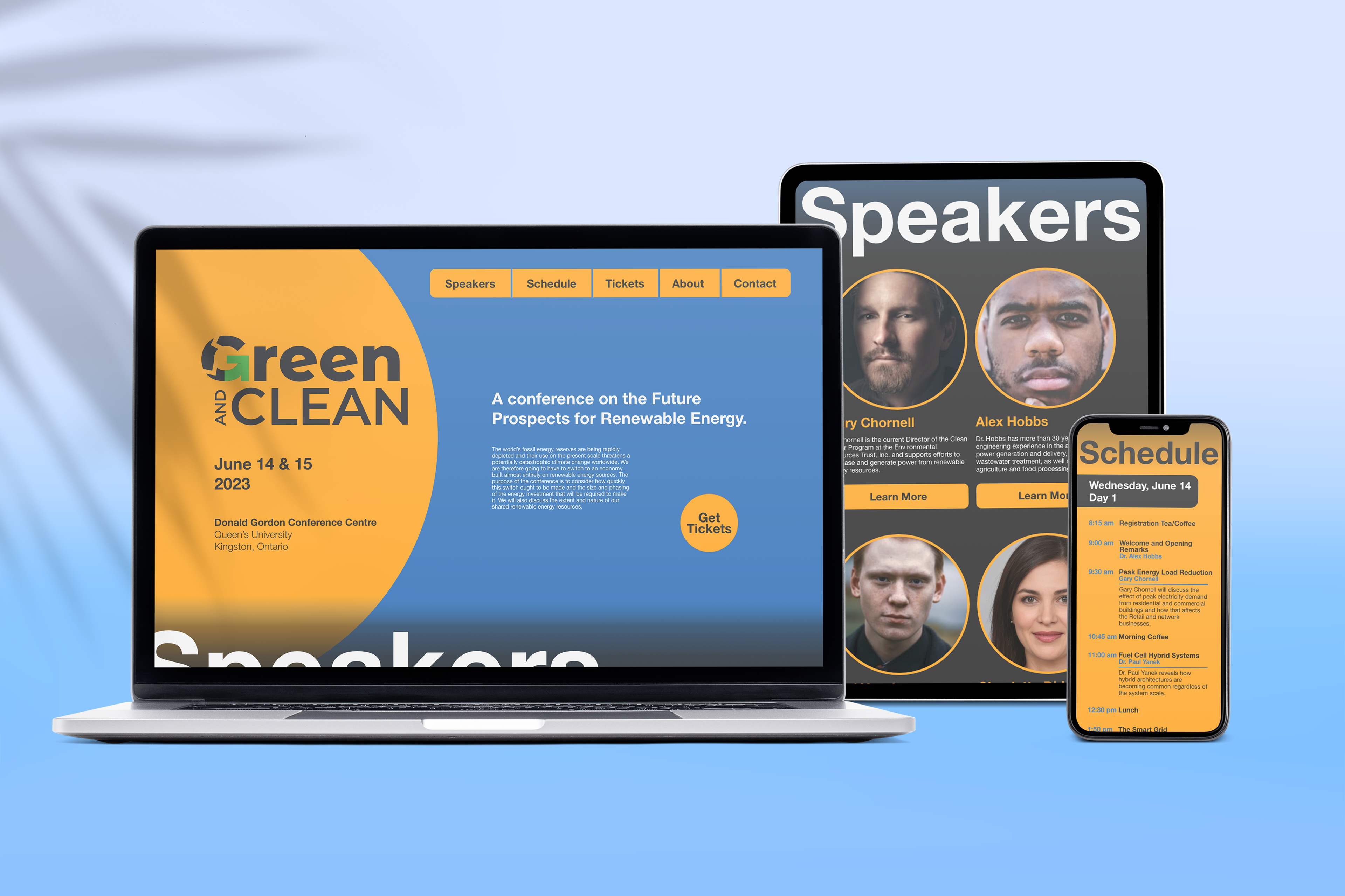
For the website, I decided to keep the rounded aspect of the sun in the poster and implement it on other elements, like the photos of the speakers or the "Get Tickets" button. I also kept the separators from the brochure and implemented them into the schedule section of the website. The titles of the different sections use most of the horizontal screen space to further emphasize separation, as this website had to have all of the content in the main page, so that people could fully explore it in one continuous scroll.
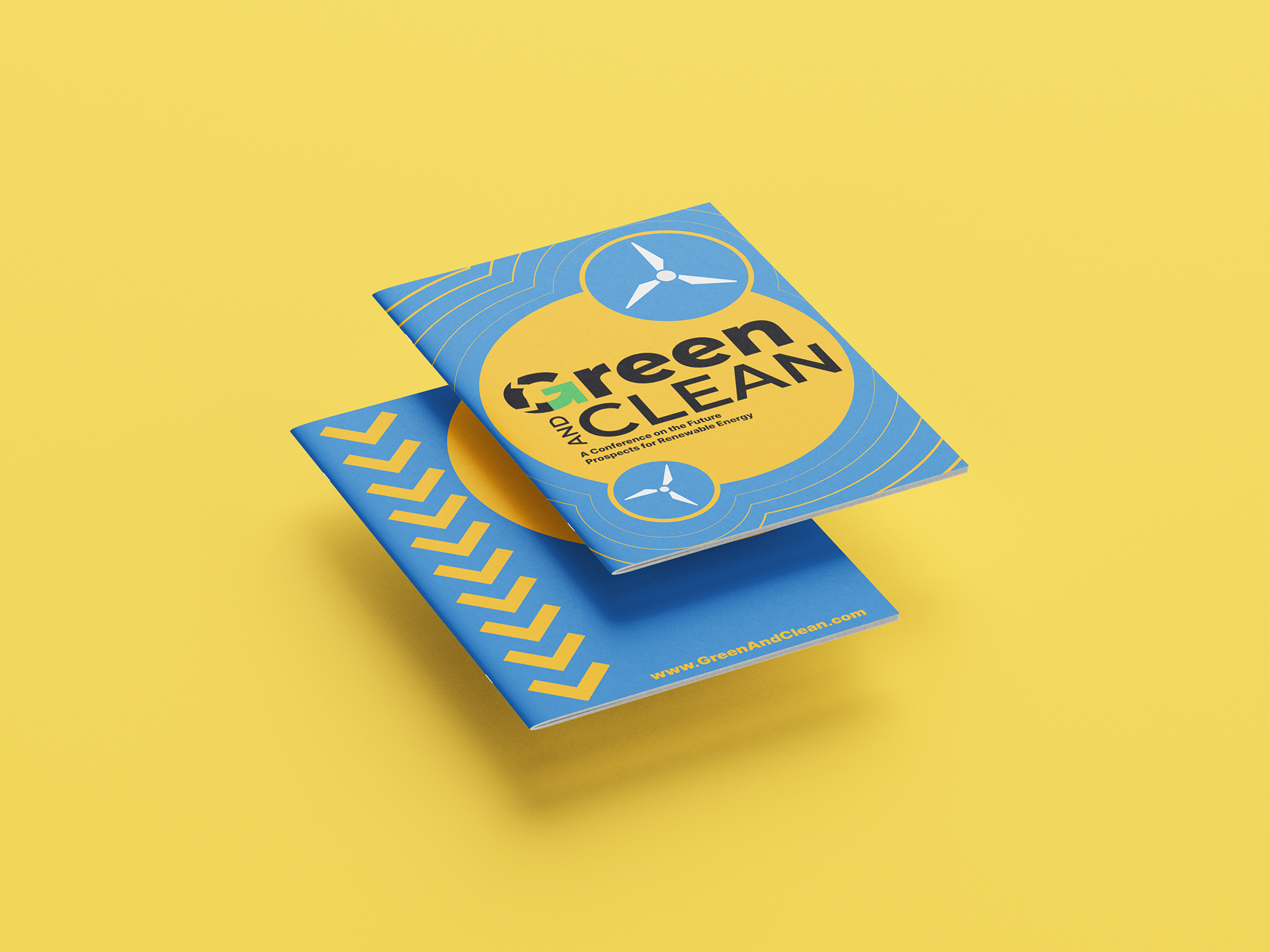
I chose a more fun and playful approach for the booklet while still keeping the usual aesthetic of the campaign, this was to evoke a feeling of happiness and excitement. I felt this was better for the project in general as taking a more business-like approach would've affected how the event is seen (soulless, boring, cliché).
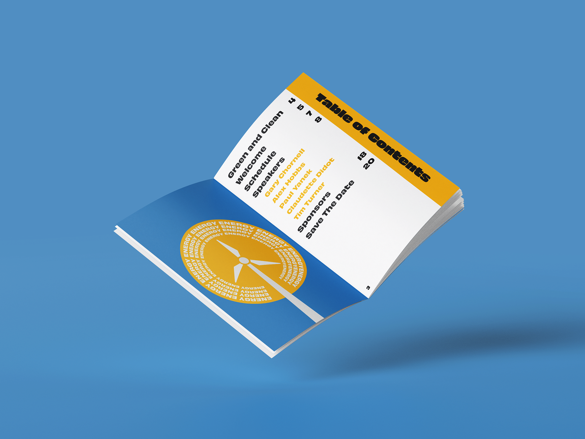
The titles for every chapter of the booklet were treated as sidebars as a nudge to the title treatment on the brochure.
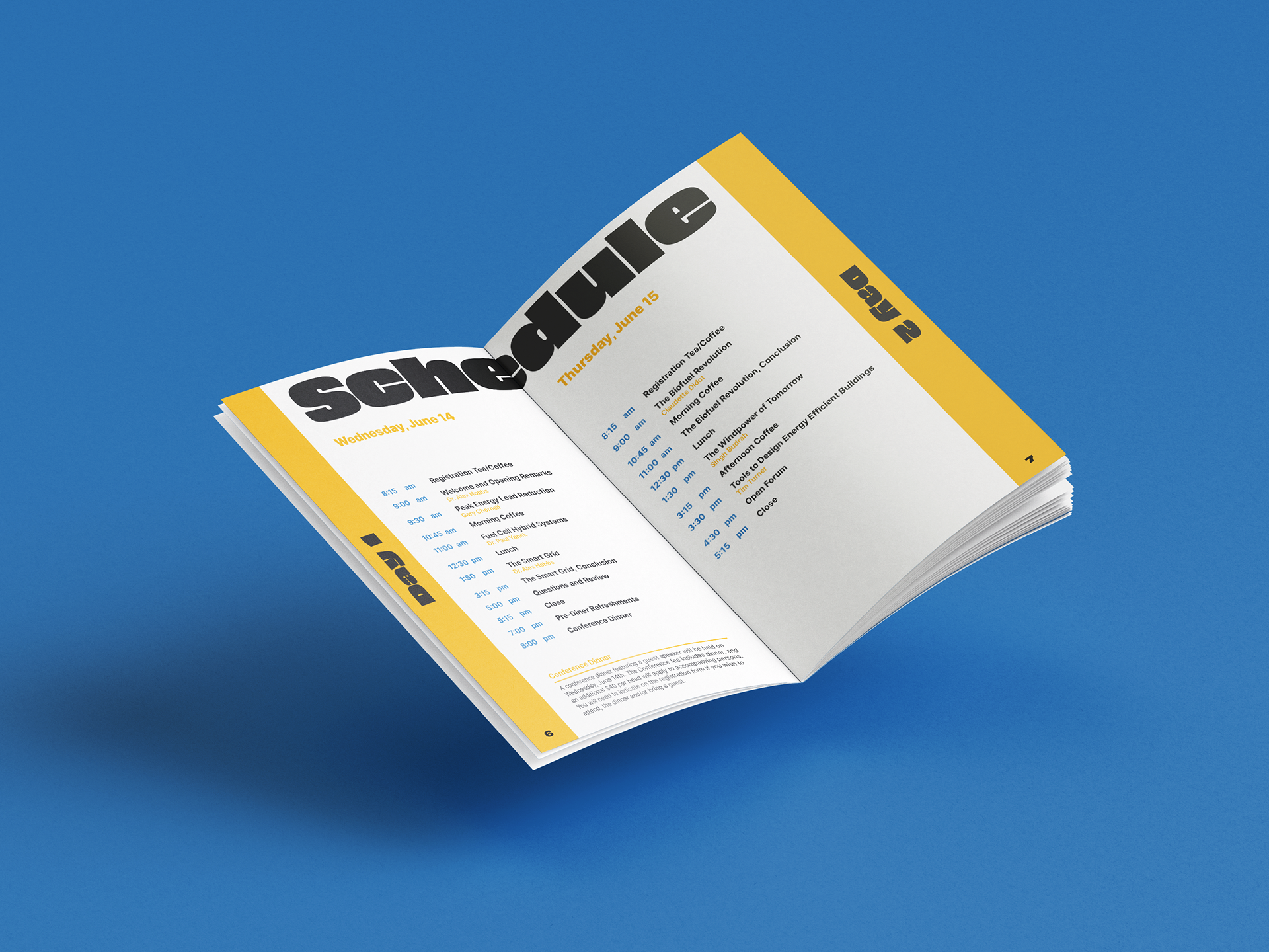
The schedule title is big enough to be readable even though it spans both pages, and it's also a nudge to the title treatment in the website, and the sidebars are used for the day number instead. Yellow was used on the speaker names and the side note so that there's separation between the hour and the title of the different events.
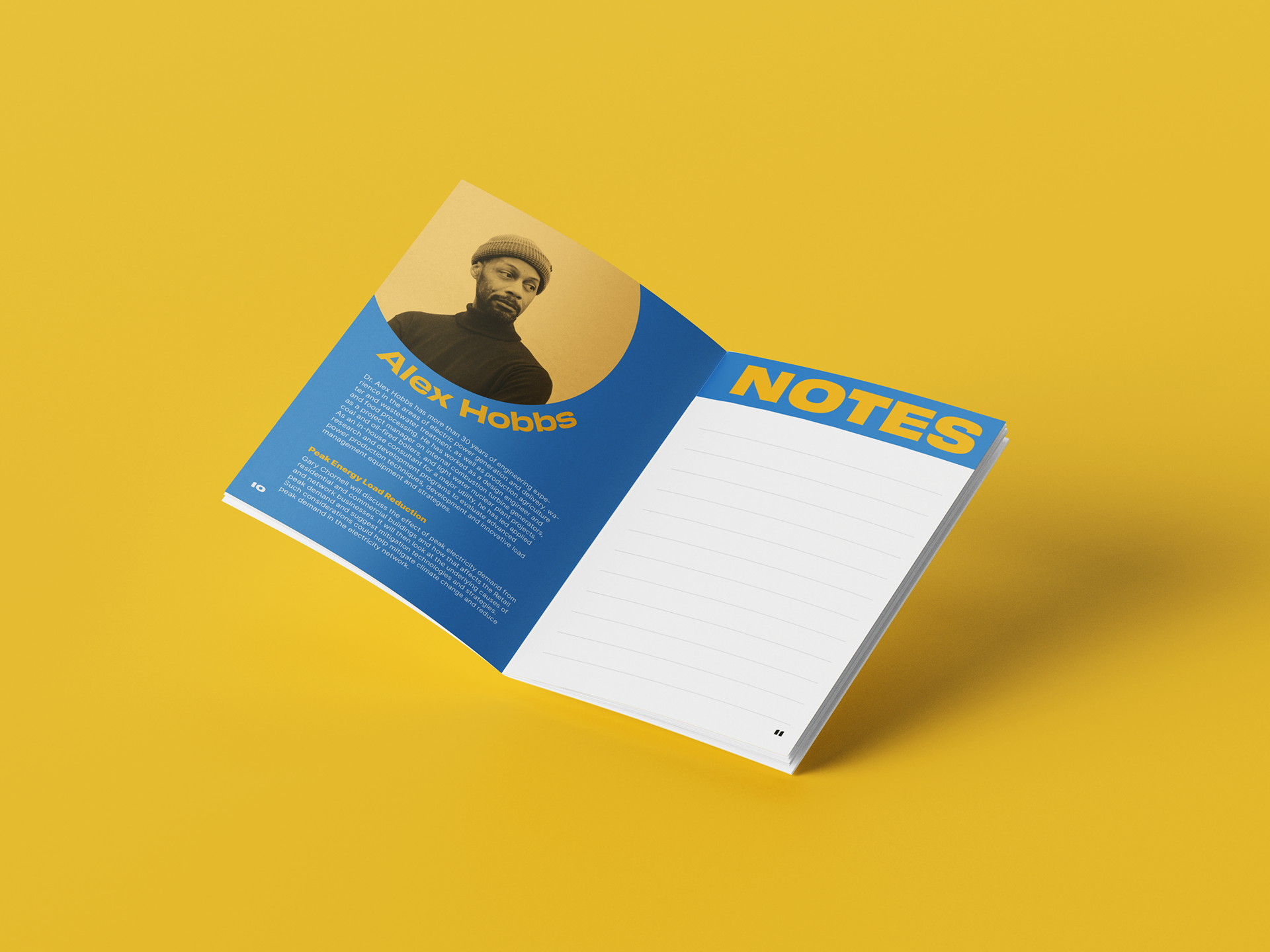
The picture of the speaker was treated so that it reassembles the circle that has been throughout the whole project. The name of the speaker follows the same path as the image so that they become a cluster.
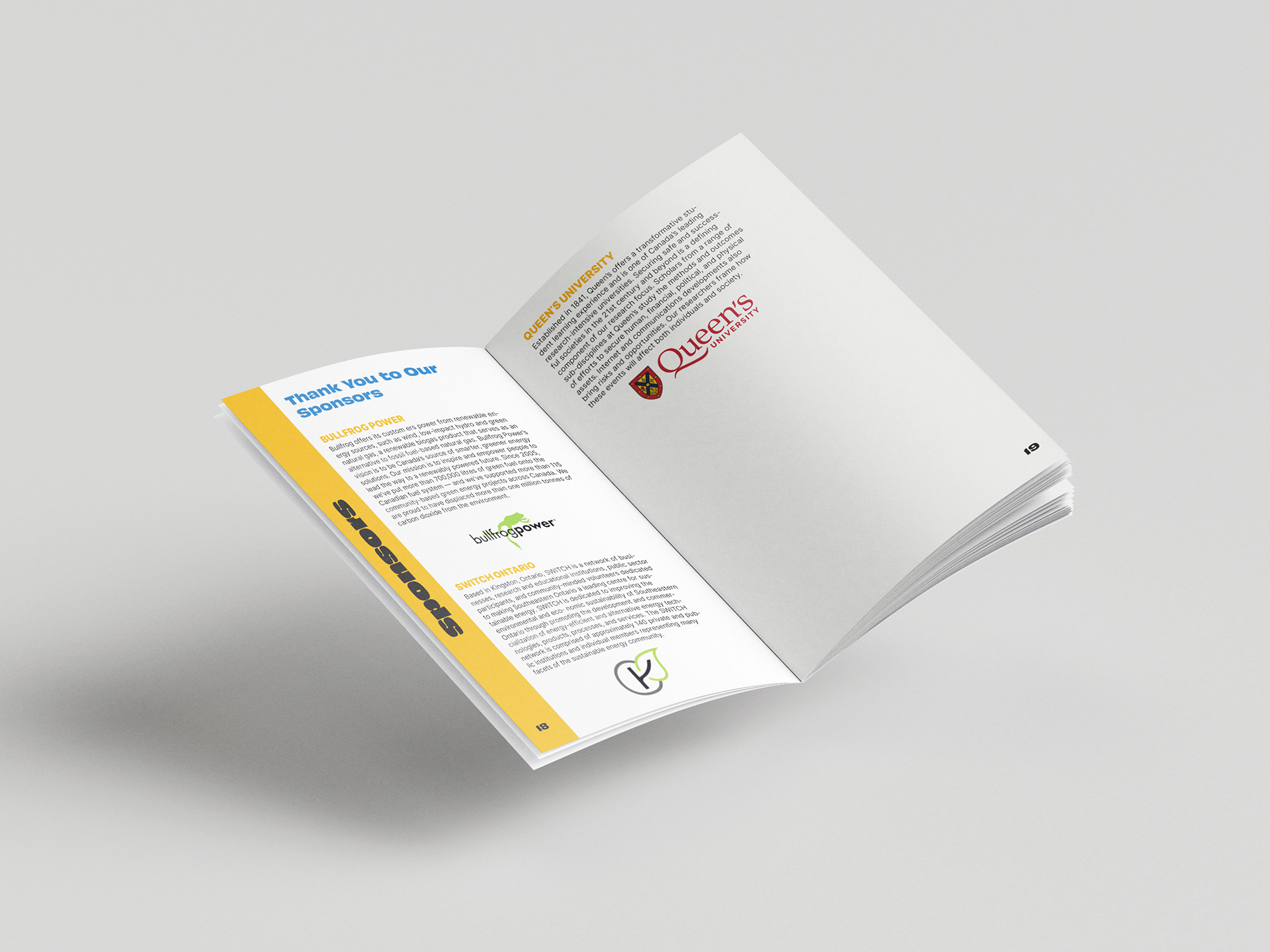
The "Thank You to Our Sponsors" text was set in blue so that it provides separation between the titles of the sponsors and the text without being too overwhelming.
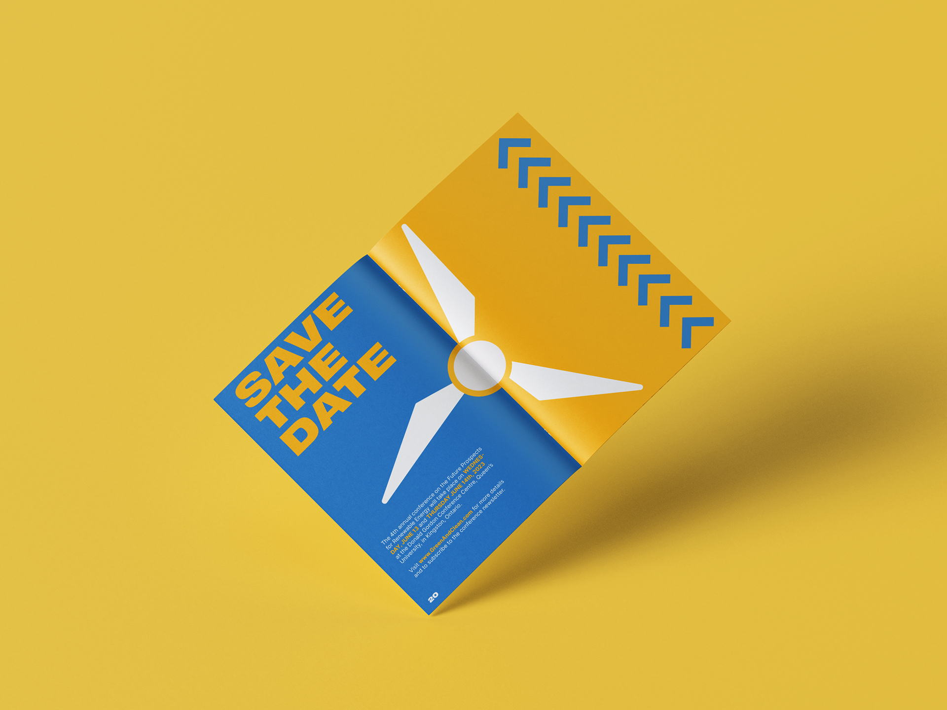
The save the date spread shows a contrast between the main colours of the campaign while also sharing an element, unifying both pages in a way.